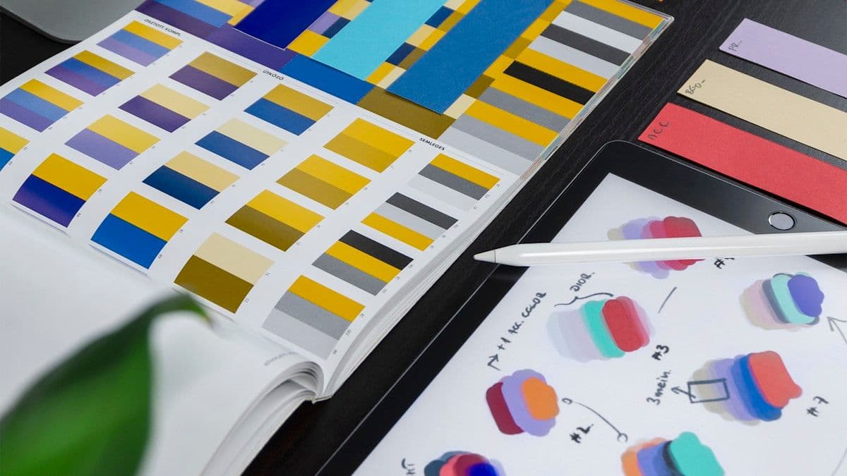
An end-to-end design system built for an enterprise product team, covering tokens, components, and documentation. The system supports five product surfaces with a shared visual language.
Delivered as a monorepo: Figma token files, a React component library published to a private npm registry, and a Storybook docs site for design-dev handoff.
Includes 80+ components, a11y coverage via Radix UI, and automated visual regression tests using Chromatic.